Diversify
Each year for clients we update a very colorful graphic ranking the annual performance of various asset classes. Each asset class has its own color, and the graphic is striking because of the kaleidoscope picture it presents: many colors, seemingly placed randomly throughout the graph.
Which is precisely the point of the graph: the colors appear randomly placed because they are. That is, it is impossible to predict the order of performance in any given year because there is no consistent pattern.
And so, the implication for investors is to diversify. If there is no way of predicting which asset will be up and which will be down in the coming year, we should own all of them, to ensure we benefit from those that do well. A disciplined rebalancing program is another good idea to smooth out the fluctuations in our overall portfolios.
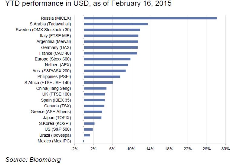
Along these lines, the graph below shows performance of various equity markets in 2015. With all the woes of the energy industry highlighted in the media every day, you might be surprised that the Saudi market is up 13% and the Russian market is up 27%. This is all in the first 6 weeks of the year. The US, up less than 2%, is near the bottom of the pack, having been among the very best markets in the prior year.
Of course, this may all just be a head-fake, white noise in the background, and could easily reverse in the next 6 weeks. I don’t know. And my guess is, neither do you (nor anyone else—especially “experts” on TV, as the WSJ cartoon below conveys). Which is precisely why we diversify our portfolios.